Best Fonts to Use for Resume
Still using Times New Roman because you think it’s the “safe” choice? Do you believe the so-called “classic” resume font might actually be a block to your chances of getting hired? Surprising, right? Recruiters silently dislike outdated fonts because they make resumes look dull, hard to scan, and even less professional.
The best fonts for a resume will absolutely make your application look sharp, modern, and recruiter-ready within seconds. You think fonts are just about design, no, it is not, it’s more about readability, professionalism, and creating that first impression. So, if you want to stand out in 2025 and beyond, let’s uncover the best fonts for resume for freshers that actually work (and the ones you should avoid at all costs).
Want to start with the basics? Check out How to Write a Resume for Freshers with Examples to build a strong foundation before diving deeper.
Best Fonts for Resume – Overview
Here’s a quick overview of the best fonts to use in resume:
| S.No. | Font | Key Strength | Best For |
|---|---|---|---|
| 1 | Calibri | Clean, modern, ATS-safe | Corporate & digital resumes |
| 2 | Arial | Simple, universal, clear | All industries, admin roles |
| 3 | Helvetica | Sleek, stylish, recruiter-fav | Design, marketing, modern profiles |
| 4 | Georgia | Elegant, readable, formal | Academic & research resumes |
| 5 | Cambria | Formal, screen-friendly | Finance, law, conservative fields |
| 6 | Verdana | Wide, clear, digital-ready | Online & digital-friendly resumes |
| 7 | Trebuchet MS | Modern, approachable | Creative & marketing roles |
| 8 | Garamond | Classic, timeless, refined | Creative, academic, elegant CVs |
| 9 | Tahoma | Compact, neat, ATS-friendly | Dense one-page corporate resumes |

List of the Best Fonts to Use in a Resume
Checking all web browsers, “Which is the best font for a resume?” is confusing. To simplify, here’s a curated list of the most professional fonts for resumes, all widely accepted by recruiters and ATS-friendly. Each comes with clear pros and cons.
1. Calibri

Calibri has been the default font for Microsoft Word and a favorite among recruiters for over a decade. Its sleek, modern, and highly readable design makes it an excellent choice for resumes. Being ATS-friendly ensures your application doesn’t get rejected due to formatting issues.
- Pros: Professional, modern, ATS-compatible, easy to read.
- Cons: Overused and may look generic in competitive industries.
- Best Suited For: Corporate, general professional roles, and digital-first resumes.
2. Arial

Arial is a clean, sans-serif font known for its simplicity and readability across screens. It is one of the safest fonts for resumes and is widely recognized by recruiters. However, since it’s so common, it can sometimes feel uninspired if not paired with strong formatting.
- Pros: Clear, simple, universally available, ATS-approved.
- Cons: Generic and lacks uniqueness.
- Best Suited For: All industries, especially corporate and administrative roles.
3. Helvetica
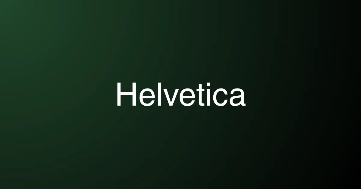
Helvetica is modern, stylish, and considered one of the most professional fonts for resume by design experts. It gives a resume a clean and polished look. However, it is not installed by default on all systems, which could cause formatting issues when opened on different devices.
- Pros: Sleek, modern, recruiter-preferred.
- Cons: Limited availability; not always supported by default.
- Best Suited For: Design, marketing, and modern professional resumes.
4. Georgia
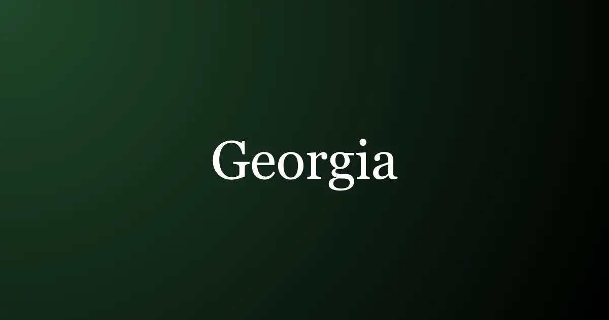
Georgia is a serif font that combines professionalism with elegance. It is more visually appealing and modern than Times New Roman, while still carrying a formal tone. This makes it ideal for academic and research-oriented resumes.
- Pros: Elegant, traditional yet modern, easy readability.
- Cons: Slightly formal for highly creative industries.
- Best Suited For: Academic, research, and formal professional resumes.
5. Cambria

Cambria was designed for on-screen reading and long documents, making it highly effective for resumes. Its professional, neat appearance makes it suitable for conservative industries.
- Pros: Digital-friendly, formal, ATS-approved.
- Cons: Conservative; may feel too rigid for creative fields.
- Best Suited For: Conservative industries like finance, law, and corporate roles.
6. Verdana

Verdana is designed for clarity, especially on digital screens. Its wide spacing makes resumes easier to read, though it can cause documents to appear longer than they are.
- Pros: Great for online resumes, highly readable, and ATS-friendly.
- Cons: Wide spacing increases page length.
- Best Suited For: Online applications and digital-friendly resumes.
7. Trebuchet MS
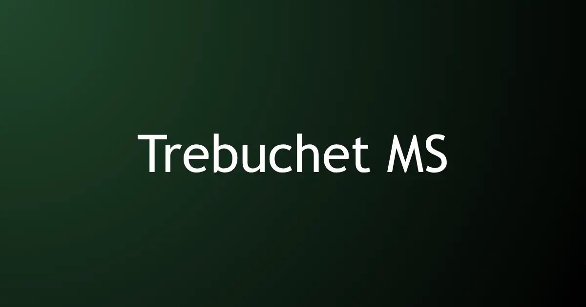
Trebuchet MS strikes a balance between professional and approachable. It has a modern, friendly appearance, which makes resumes feel less rigid. However, it may not work well in highly traditional industries.
- Pros: Approachable, recruiter-friendly, modern.
- Cons: Informal tone; not suitable for legal or finance fields.
- Best Suited For: Creative, marketing, or approachable professional resumes.
8. Garamond
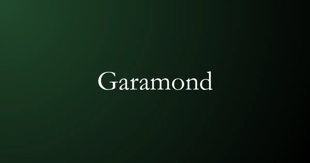
Garamond is a classic serif font that offers elegance and readability. It is a more stylish alternative to Times New Roman, often used in academia and creative industries. However, it may appear old-fashioned in tech-focused roles.
- Pros: Elegant, timeless, professional.
- Cons: Too traditional for modern or creative industries.
- Best Suited For: Creative, academic, and elegant resume layouts.
9. Tahoma

Tahoma is a clean, balanced sans-serif font that works well for compact resumes. Its slightly narrower design allows more content to fit on one page without sacrificing readability.
- Pros: Compact, professional, ATS-friendly.
- Cons: Narrow spacing may feel dense if overused.
- Best Suited For: Compact resumes, dense content, and corporate settings.
Looking for tools to apply these fonts easily? Explore the Top 10 Free Online Resume Builders in 2025 to craft your professional resume in minutes.
How to Choose a Resume Font for Your Industry
Still wondering which font is good for a resume? Here’s a quick guide to match the font style for resume/CV font style with industry expectations:
1. Corporate & Finance – Calibri, Arial, Cambria
These font styles for a resume convey professionalism, are highly readable, and ATS-approved for banking, consulting, and finance roles.
2. Creative & Marketing – Helvetica, Trebuchet MS, Verdana
Stylish and modern CV font styles that reflect creativity while maintaining professionalism for marketing, design, and startup positions.
3. Academia & Research – Georgia, Times New Roman, Garamond
A traditional serif font style for a resume signals credibility and a formal tone for academic, research, and legal roles.
4. Technology & IT – Calibri, Arial, Tahoma
Clean, digital-friendly CV font styles are ATS-compatible and screen-readable, perfect for software developers, engineers, and IT specialists.
5. Startups & Modern Businesses – Helvetica, Trebuchet MS
Sleek, approachable fonts align with the innovative, fast-paced environment of modern workplaces.
Not sure how long your resume should be? Read Should Freshers Stick to a One-Page Resume? to make the right decision.
Resume Font Selection Tips
Choosing the right font is easy when you follow these key tips for a professional resume:
- Use 10–12 pt for body text, 14–16 pt for headings.
- Stick to black or dark gray font colors for readability.
- Limit yourself to 1–2 fonts for consistency.
- Keep uniform spacing and formatting to ensure clarity.
- When unsure, Calibri or Arial are safe and effective choices.
Common Mistakes to Avoid
Avoid these font blunders to ensure you choose the best fonts for resume that looks professional and passes ATS scans:
- Using decorative or script fonts like Comic Sans or Papyrus.
- Mixing three or more fonts in one resume.
- Using too small (<10 pt) or too large (>14 pt) font sizes.
- Bright or unconventional colors that reduce readability.
- Ignoring ATS compatibility when selecting a font.
Perfect Your Resume with GUVI’s Tools
Even the most professional fonts for a resume cannot compensate for poor formatting or structure. A well-structured resume increases recruiter attention and passes ATS filters effortlessly.
With GUVI, candidates can get the answer to the prolonged question ‘what is the best font for a resume?’, can build their resume with GUVI’s Free Resume Builder, and instantly check their resume score with the ATS Resume Checker. Both tools help freshers and professionals create ATS-friendly, recruiter-ready resumes that stand out in 2025.
Final Words
Fonts may seem like a minor detail, but they shape the first impression recruiters form about your application. Choosing the best fonts for resume ensures clarity, professionalism, and readability. A modern, clean, and ATS-friendly font conveys competence and attention to detail. In today’s competitive job market, font selection is not just style; it’s strategy.
Explore More Resume Articles
- Best Resume
- Email Resume
- CV vs Resume
- ATS Checkers
- Resume Skills
- Mobile Resume
- Edit Resume
- Career Objective
- Internship Resume
- Resume Templates
FAQs
Calibri, Arial, Helvetica, Georgia, and Cambria are top choices and the best fonts for resume because they’re clean, professional, and easy to read across digital and printed formats.
Your font sets the tone of your resume, affects readability, and ensures it passes through ATS systems without errors.
Arial, Calibri, Cambria, and Georgia are highly compatible with Applicant Tracking Systems, helping your resume avoid formatting issues.
Serif fonts like Georgia look traditional; sans-serif fonts like Arial appear modern. Choose according to the industry.
Keep body text between 10–12 pt for readability and use 14–16 pt for headings so they stand out without overwhelming the layout.
Avoid decorative or script fonts, as they reduce clarity and can confuse ATS systems; stick to professional, simple fonts instead.
Using more than two fonts creates clutter. Ideally, stick to one font style and size variation for a consistent, polished look.
Clear fonts improve scanning speed, make details stand out, and ensure your resume looks professional to both recruiters and software.


Hi, I’m Hashmithaa. I believe in the power of words to connect and guide. As a content writer, I craft stories and insights that are relatable, practical, and designed to help readers learn, evolve, and navigate the online world.


Hi, I’m Hashmithaa. I believe in the power of words to connect and guide. As a content writer, I craft stories and insights that are relatable, practical, and designed to help readers learn, evolve, and navigate the online world.
Related Posts
How to Write a LinkedIn Summary: Tips, Examples & Best Practices (2026 Guide)
Open ten LinkedIn profiles from people applying for the same role, and you'll notice a pattern. Many use the same …


Warning: Undefined variable $post_id in /var/www/wordpress/wp-content/themes/placementpreparation/template-parts/popup-zenlite.php on line 1050
so far feels like...
